觸瞇
Touch me
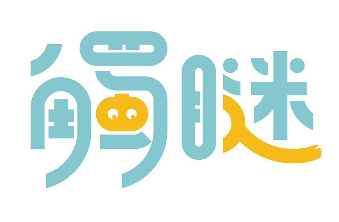
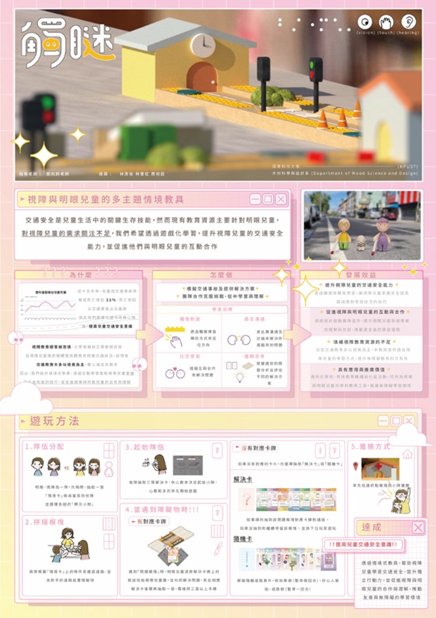
標準字「觸瞇」設計以藍黃對比確保弱視及明眼兒童的可讀性。「觸」字嵌入眼睛圖案,象徵視障者的視覺感知,而「瞇」字筆畫延伸為手部造型,代表觸摸與引導,強調視障者透過觸覺探索世界,與遊戲學習體驗相呼應。字體設計提升辨識度並突顯包容性,使視障與明眼兒童皆能理解資訊並參與學習。
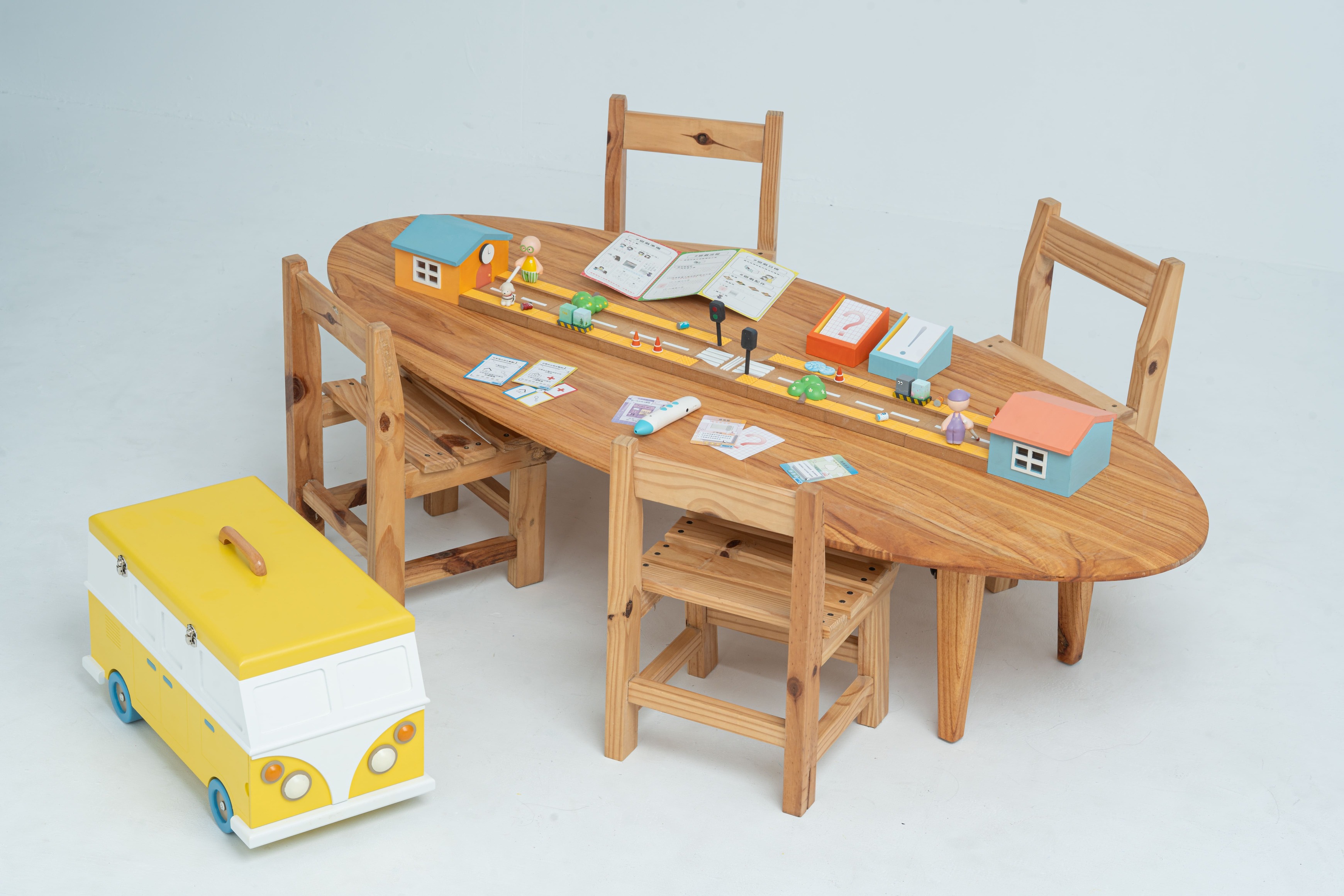
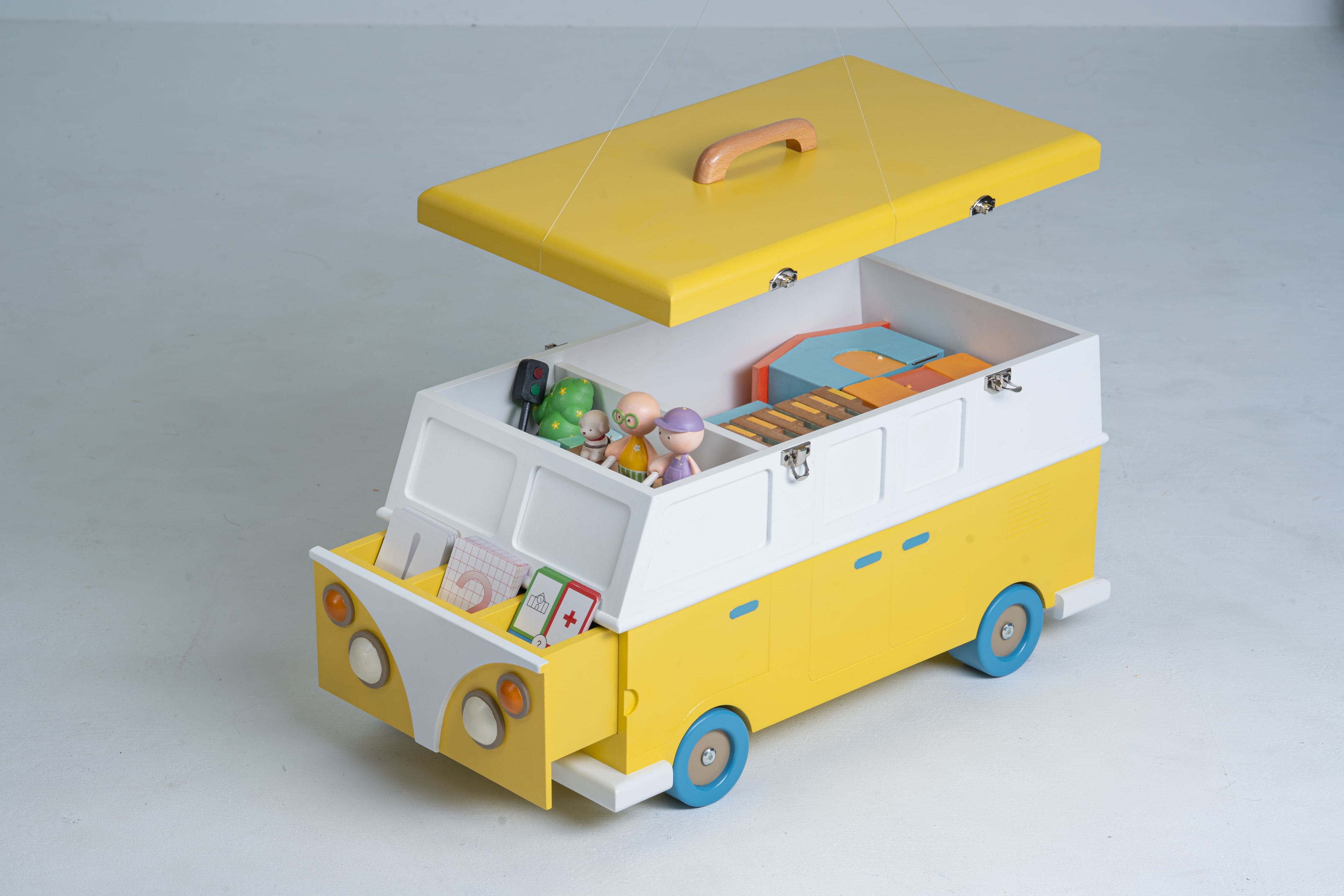
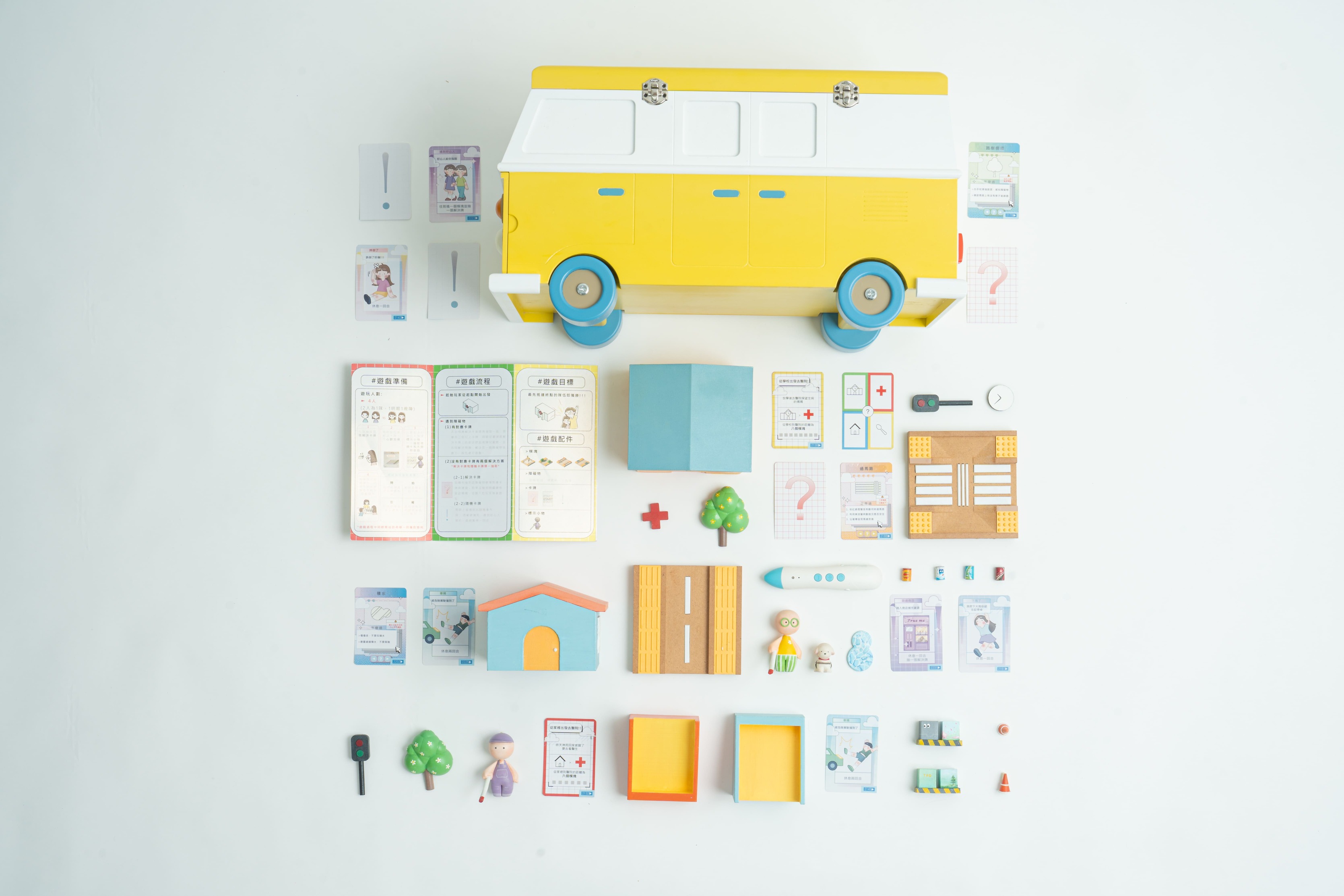
色彩運用選擇紅、橘、黃等高辨識度色彩,搭配高對比設計,使資訊清晰並吸引孩童興趣。多數視障者可部分感知色彩,因此標示與終點模塊的房屋及卡牌架採用藍、橘、黃對比配色,提升辨識度與視覺焦點。避免過度鮮豔造成視覺疲勞,降低藍黃彩度減少壓力,保留橘色較高彩度,以吸引注意力但不過度刺激。這些色彩與模塊上的黃色導盲磚及車輛包裝相呼應,確保視覺統一性。標示小物選用綠色與紫色平衡對比色,確保辨識度並減少視覺負擔。
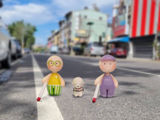
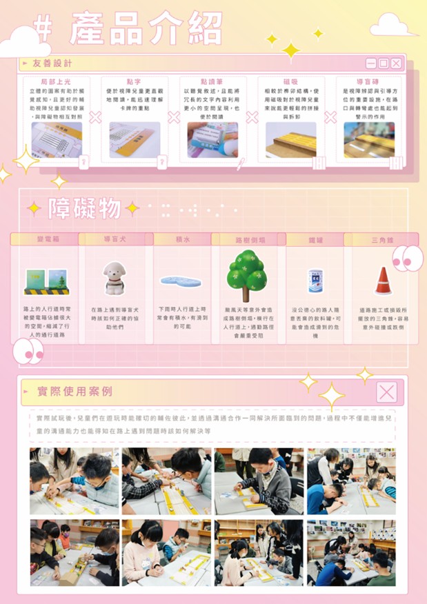
角色採無性別設計,避免刻板印象。簡單五官與柔和腮紅增強親和力,使玩家可投射自身角色。障礙物模擬台灣街頭常見場景,如變電箱、鐵罐、三角錐,讓孩童在遊戲中建立環境認知,提升互動與學習效果。
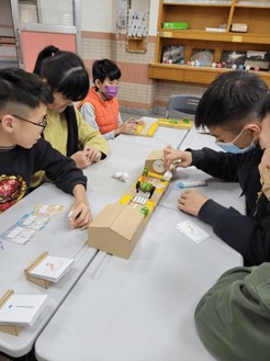
透過這樣的設計,不僅幫助視障兒童熟悉環境,也讓明眼兒童體驗視障者行走時的挑戰,進一步提升社會對無障礙設計的關注,促進兒童理解與合作,打造友善學習環境。
Touch me
The "TouchMe" standard typeface is designed with blue and yellow contrast to ensure readability for both visually impaired and sighted children. The character "觸" incorporates an eye symbol, representing the visual perception of visually impaired individuals, while the character "瞇" extends its strokes into a hand shape, symbolizing touch and guidance. This highlights how visually impaired individuals explore the world through touch, aligning with the game’s learning experience. The typeface design enhances recognition and emphasizes inclusivity, allowing both visually impaired and sighted children to access information and participate in learning.
The color scheme includes red, orange, and yellow, which are highly recognizable, combined with a high-contrast design to make information clear and engaging for children. Since many visually impaired individuals can partially perceive colors, the markers, endpoint modules (houses), and cardholders use blue, orange, and yellow contrast to enhance recognition and focus. To prevent excessive visual strain, blue and yellow saturation is reduced to minimize pressure, while orange maintains higher saturation to attract attention without overstimulation. These colors also correspond to the yellow tactile paving and vehicle packaging, ensuring visual consistency. Markers are designed in green and purple, balancing contrast for better recognition while reducing visual fatigue.
The characters are gender-neutral to avoid stereotypes. Their simple facial features and soft blush details enhance their approachability, allowing players to relate to them.
Obstacles are modeled after common street elements in Taiwan, such as electrical boxes, metal cans, and traffic cones, enabling children to develop environmental awareness through gameplay, enhancing interaction and learning effects.
Through this design, visually impaired children can become familiar with their surroundings, while sighted children can experience the challenges faced by the visually impaired. This further raises awareness of accessible design, encouraging understanding and cooperation among children, and creating an inclusive learning environment.
國立屏東科技大學 木材科學與設計系
(四年級)
林彥佑
國立屏東科技大學 木材科學與設計系
(四年級)
應宛庭
國立屏東科技大學 木材科學與設計系
(四年級) 指導老師 鄧兆鈞