聚光軌跡|循著軌跡,探索雲林
Luminous Journey|Follow the trails and explore Yunlin


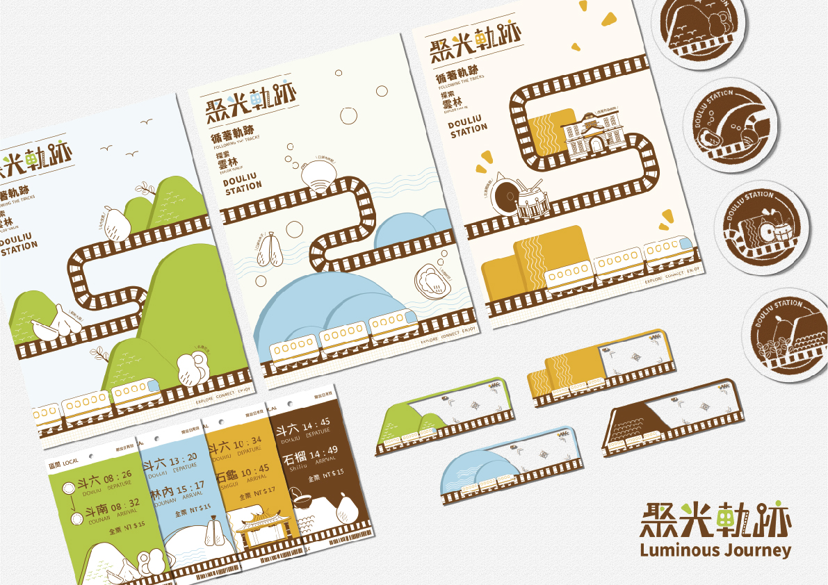
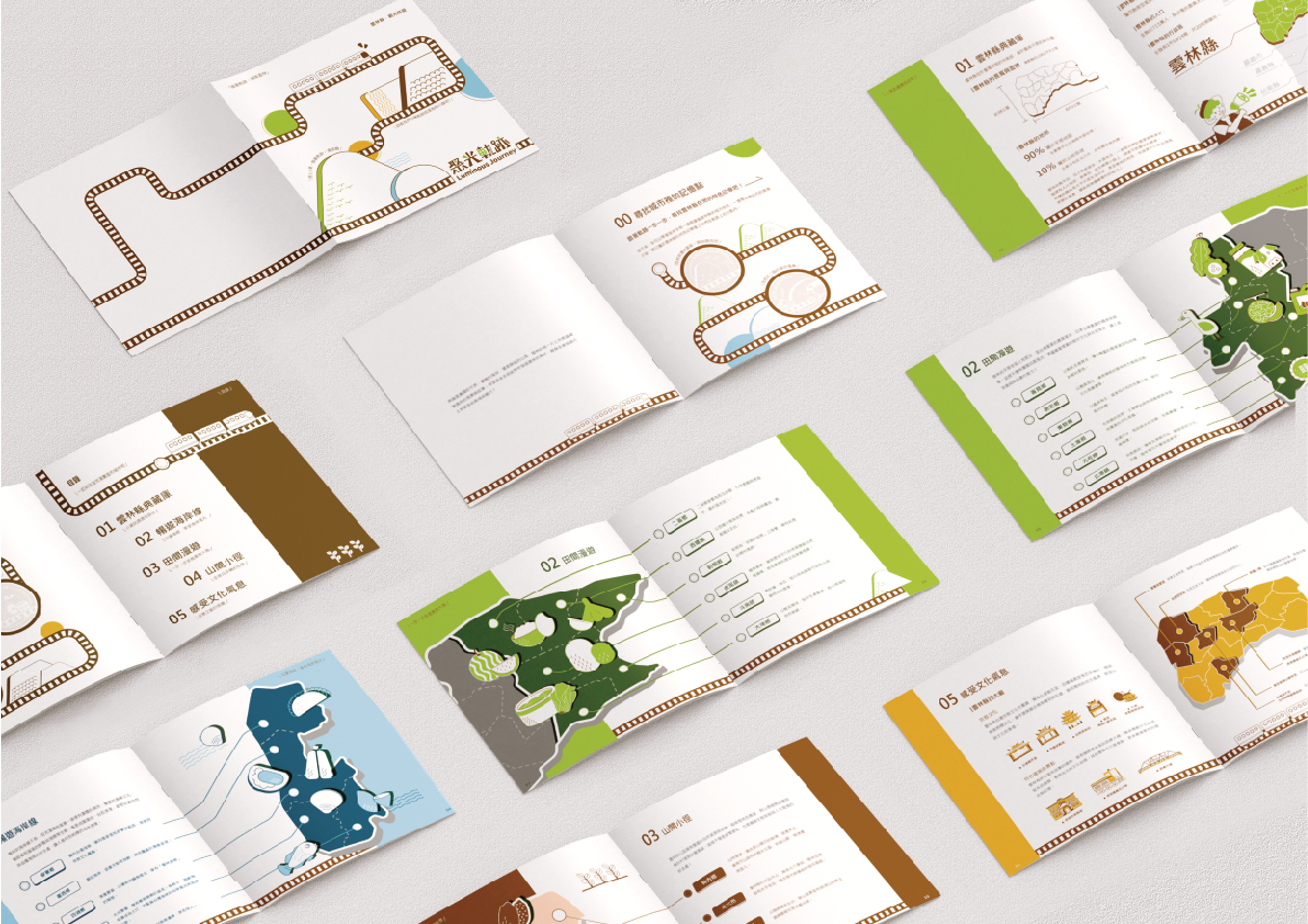
我們以車站為起點,串聯雲林豐富的觀光資源,透過軌道引導旅客探索山海與文化,打造一場從「移動」出發的地方體驗。雲林擁有多元的地景樣貌與深厚的人文底蘊,從沿海漁村到平原農田,從宗教信仰到歷史建築,皆蘊藏豐富的旅遊魅力。我們重新梳理縣內的自然與文化特色,以車站為連結節點,規劃視覺應用,讓旅人一抵達,就能感受到這片土地的溫度與故事。
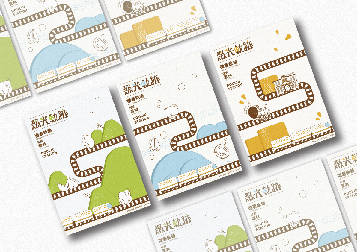
視覺設計透過象徵地景的色彩系統,結合幾何構成語彙,營造出簡潔且富親和力的觀光形象。田野綠、海岸藍、山丘咖與稻穗黃分別代表雲林的自然風貌與人文精神,統整多元場域並提升整體識別度。設計不僅傳遞旅遊資訊,更希望引導旅人慢下腳步,深入探索每一處值得駐足的角落,發現雲林的多元與驚喜,讓旅程不再只是移動,更是與地方產生連結的全新體驗。
Luminous Journey|Follow the trails and explore Yunlin
We begin at the train station, connecting Yunlin’s rich tourism resources and guiding travelers through its landscapes and culture via the railway. This isn’t just about moving from place to place—it’s about crafting a local experience through movement. From coastal fishing villages to vast farmlands, from religious traditions to historic architecture, Yunlin is full of vibrant sights and stories. By reinterpreting its natural and cultural features, we position the station as a key point of connection, using visual design to let visitors feel the warmth and character of Yunlin the moment they arrive.
The visual identity draws from colors inspired by local scenery—Field Green, Coastal Blue, Hill Brown, and Rice Yellow—each representing a facet of Yunlin’s environment and cultural spirit. Paired with geometric elements, the design creates a clean and welcoming image that unifies diverse destinations and strengthens overall recognition. Beyond conveying information, it encourages travelers to slow down, explore more deeply, and discover the surprises hidden in every corner—transforming the journey into a meaningful connection with Yunlin’s people, places, and stories.
雲林科技大學 創意生活設計系
(四年級)
林子翔
雲林科技大學 創意生活設計系
(四年級)
林子筠
雲林科技大學 創意生活設計系
(四年級) 指導老師 黃世輝