鴉
Karasu
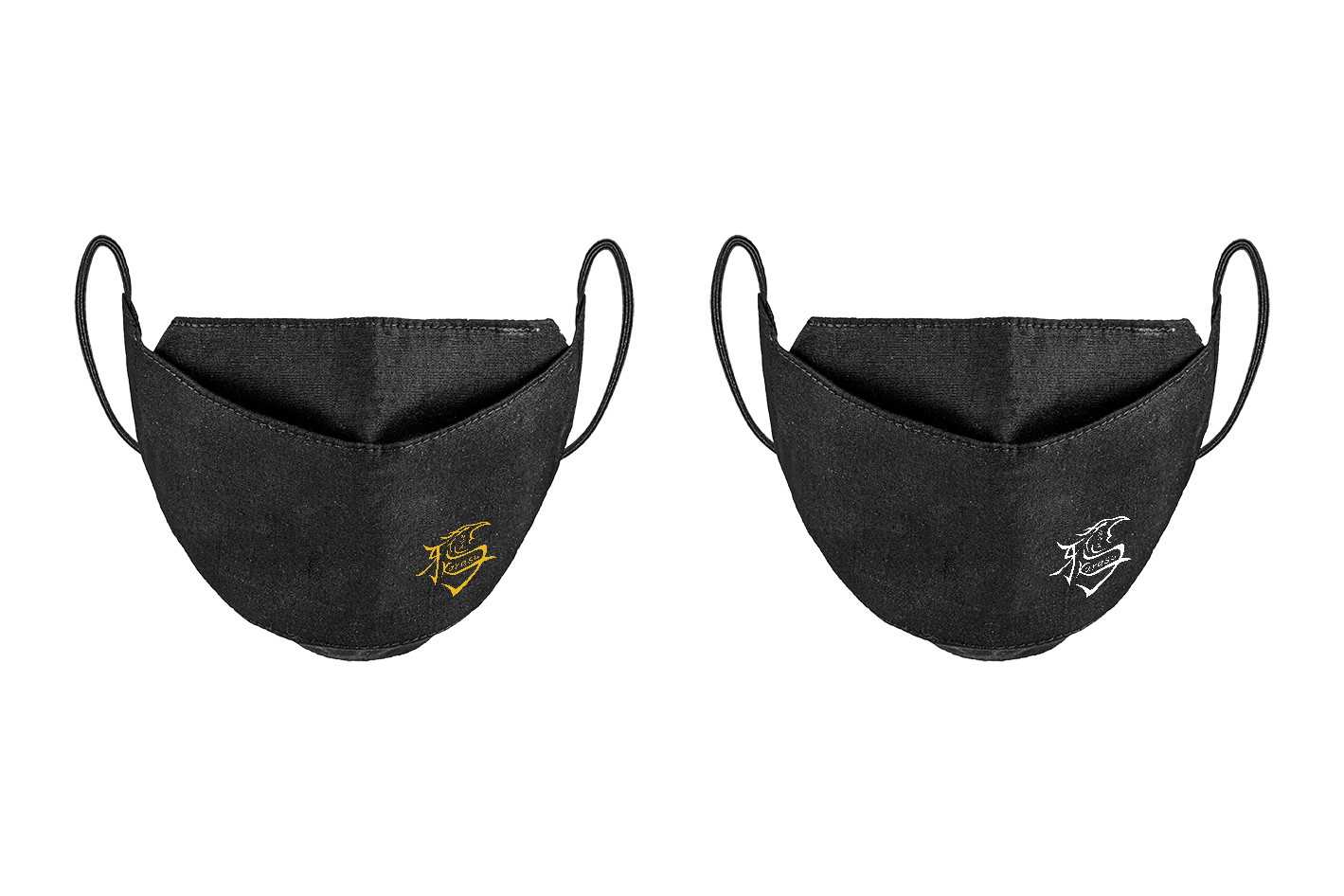



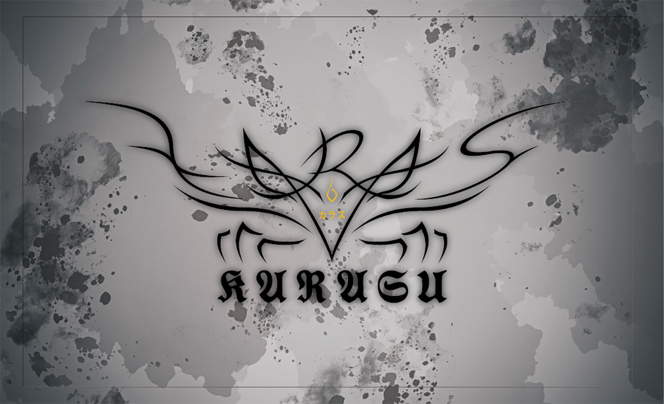
「Karasu(鴉)」是一支以 Metalcore(重金屬) 為主的獨立樂團,編曲追求力量與情感張力。樂團由主唱「太陽(金烏)」領軍,率領群鴉(樂手)以音樂展現生命的強韌。烏鴉象徵即便生存環境惡劣,也能吞噬絢爛色彩,最終凝鍊為深沉而亮麗的「黑色」。
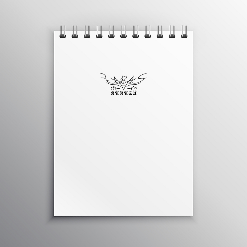
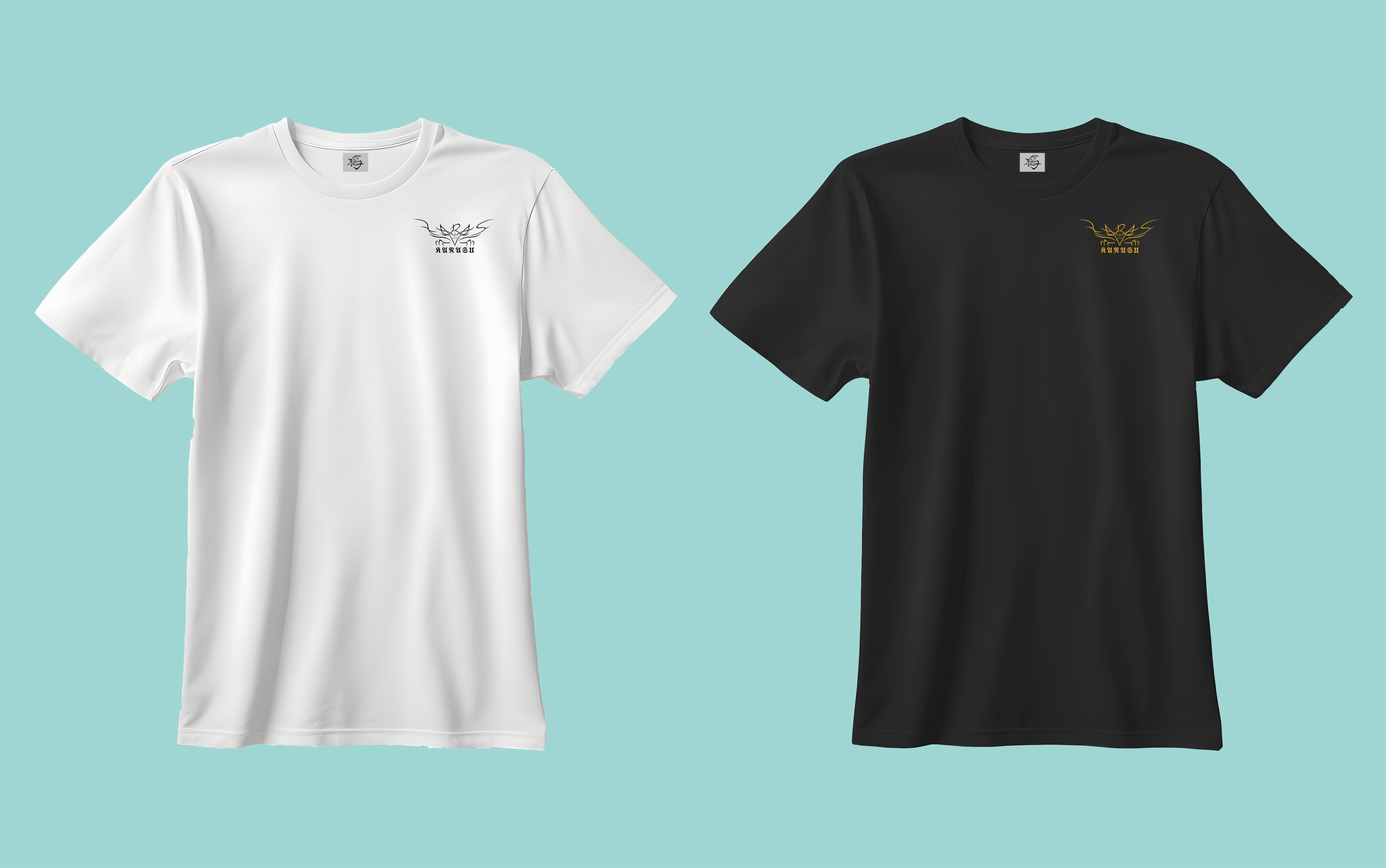
視覺形象以烏鴉為核心設計,展現樂團精神與風格。黑、白、黃三色搭配:黑色 象徵混沌與烏鴉的本質,白色 代表希望與微光,黃色 則寓意太陽與金烏,象徵燃燒的熱情與光明指引。Logo 設計融合漢字「鴉」與日文字「カラス」,剛勁筆觸與不規則變形強化品牌獨特性。
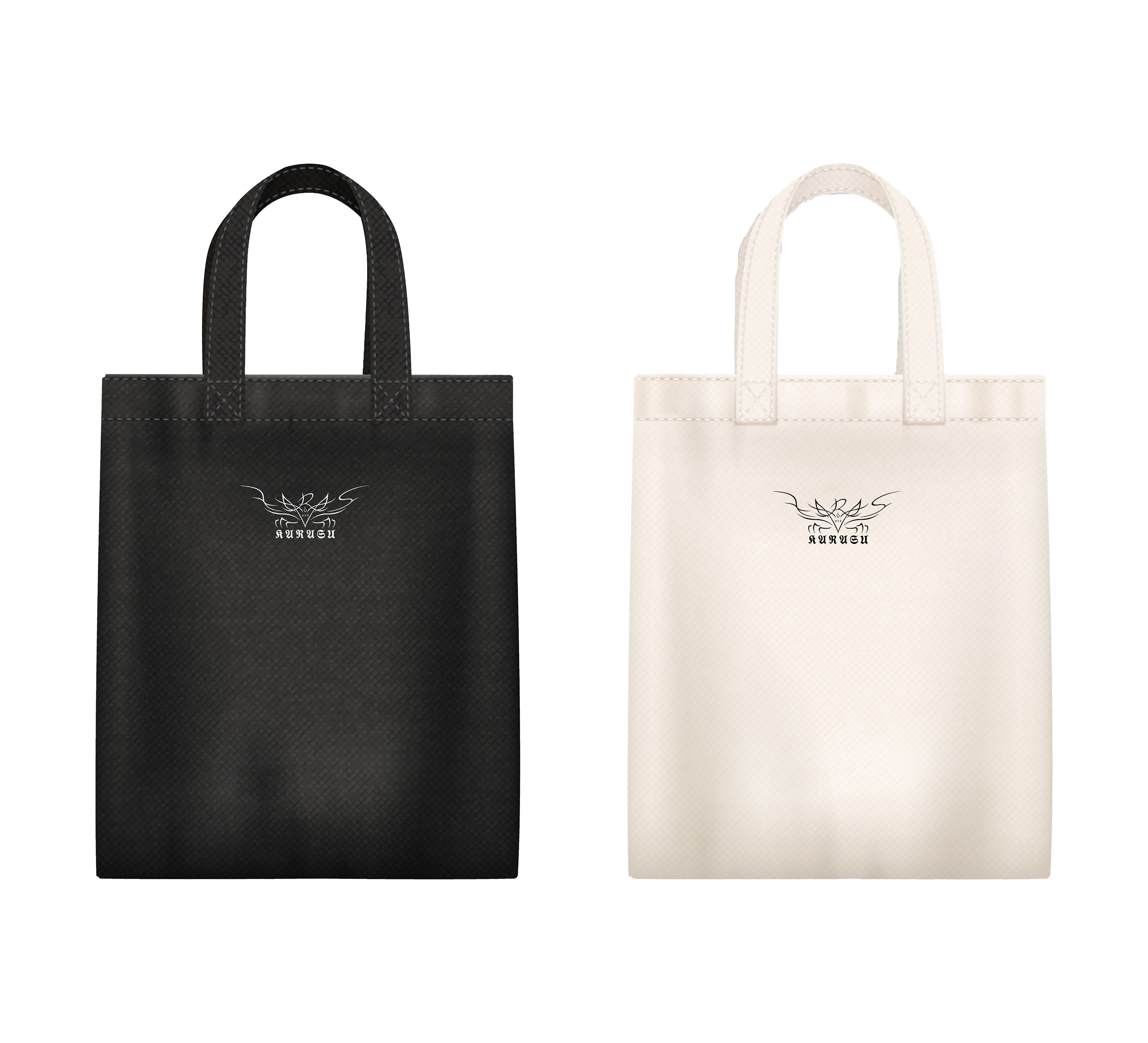
目標客群鎖定 獨立音樂愛好者、音樂祭觀眾 及 偏好不規則版型設計的消費者。周邊商品以實用性為主,如 雨傘、帆布袋、水壺、貼紙、悠遊卡、口罩、帽子、鐵牌吊飾 等,未來亦規劃 外套、露營椅、毛巾、野餐墊、手機殼 等產品。
無論是誰,都無法選擇自己的生存環境,每個人都將面臨挑戰。因此,我們更要奮力拼搏,如聰明機靈、生命力強韌的烏鴉,適應環境,突破極限,展翅高飛。「Karasu(鴉)」不僅是樂團標誌,更是一種精神象徵 —— 用音樂吶喊內心,帶著黑影,勇敢追尋光明。
Karasu
Karasu is an independent band with a Metalcore music style, focusing on power and emotional intensity. Led by the vocalist Taiyo (Golden Crow), the band members ("the flock") use music to showcase resilience and strength. The crow symbolizes the ability to survive even in harsh environments, consuming vibrant colors and ultimately refining them into a deep yet radiant black.
The visual identity is centered around the crow, representing the band’s spirit and style. The color scheme consists of black, white, and yellow: black symbolizes chaos and the crow’s essence, white represents hope and light, while yellow embodies the sun and the golden crow, signifying burning passion and guidance. The logo design merges the Chinese character 「鴉」 and the Japanese 「カラス」, using bold strokes and irregular shapes to enhance brand uniqueness.
The target audience includes independent music fans, music festival attendees, and those who appreciate unconventional fashion styles. The merchandise emphasizes practicality, featuring umbrellas, canvas bags, water bottles, stickers, IC cards, masks, hats, and metal keychains, with future plans for jackets, camping chairs, towels, picnic mats, and phone cases.
No one can choose the circumstances of their birth—everyone must face challenges. That is why we must fight for ourselves, like the intelligent, adaptable, and resilient crow, overcoming limits and soaring high. Karasu is more than just a band logo; it is a symbol of spirit—expressing our inner voice through music, carrying the shadows, and boldly chasing the light.
建國科技大學 商業設計系
(四年級)
王承頡
建國科技大學 商業設計系
(四年級) 指導老師 曾曄鴻