馬太林品牌形象設計
Matadim Brand Identity Design
馬太林太陽米是一個來自花蓮玉里的阿美族小農品牌,
因品牌曝光度不足、販售通路受限等問題而陷入困境。
若能為它重新塑造品牌形象,透過完善和煥新其品牌故事、識別設計及包裝外,也希望能加強行銷宣傳,以提升品牌的市場知名度和競爭力,讓馬太林太陽米佔據更多消費者的視野,以期煥發新生機。
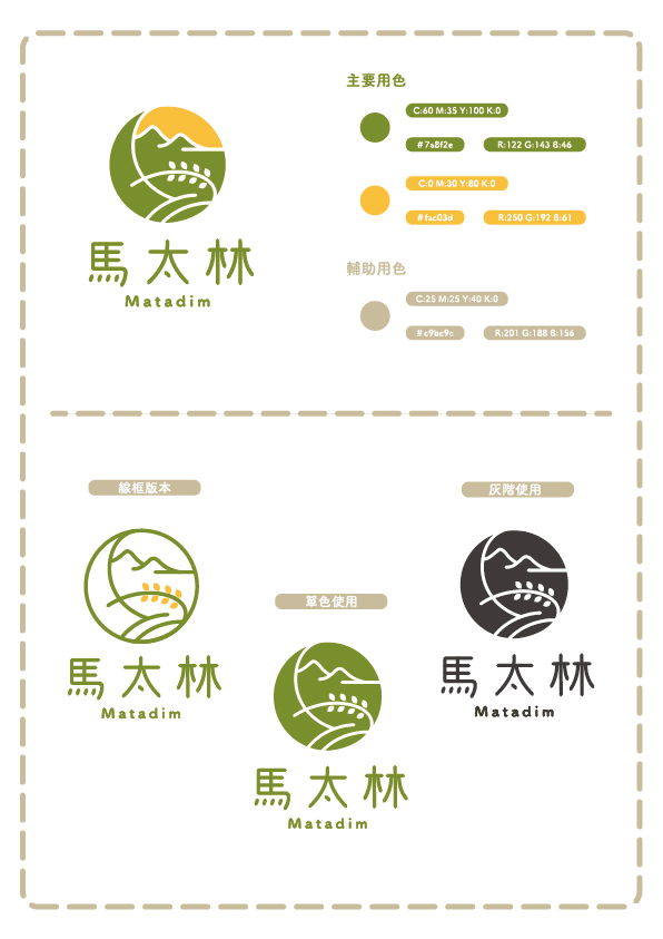
識別設計:以"太陽米"為發想,將品牌首字"馬"與圓結合,運用曲線,在圓中勾勒出上緣的層山連綿,與底部的稻田阡陌與稻穗,並將弦月輪廓隱於其中。 中文標準字也延續曲線勾勒的方式,在筆畫中強調弧線,確保辨識度清晰的同時,賦予其新芽破土般的童趣和生機。日月軌跡的流轉,青山稻田的縮影,共同構築出馬太林太陽米的品牌印象。
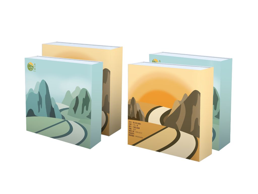
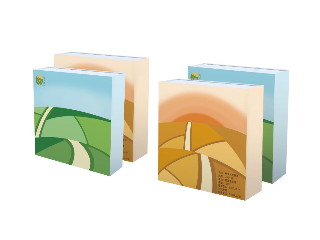
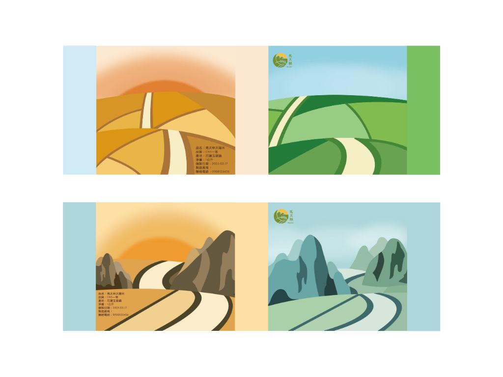
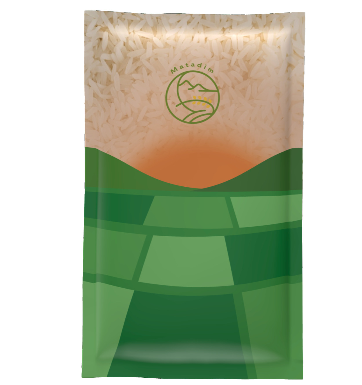
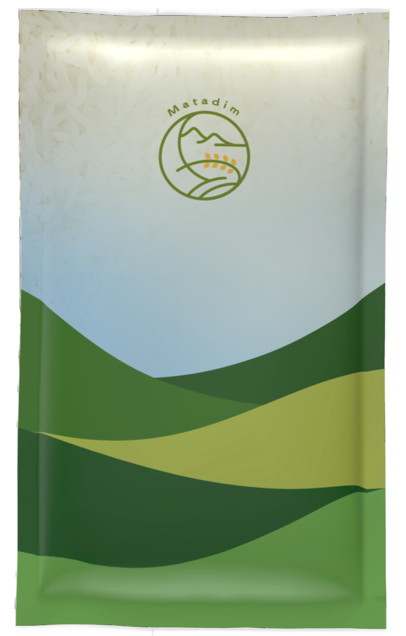
包裝設計:藉由品牌故事提到的自然環境,我們以此為發想,設計兩款田與山的包裝設計。
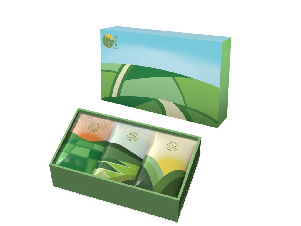
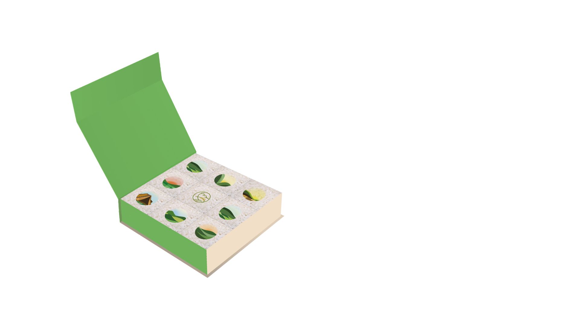
而方形禮盒包裝,每份以150克獨立包裝,總重約1.3公斤左右,主打以小份量的形式,讓小家庭、單身族群也能購買。另一款的長型禮盒,每份以200克左右獨立包裝,每盒內附有三包,每包每款皆以隨機出貨的方式,總重約600克左右。
Matadim Brand Identity Design
Matadim Sun Rice is a relatively small, yet distinctive farming brand that originates from the Amis tribe in the picturesque region of Yuli, Hualien. Despite its strong cultural heritage and quality products, the brand has faced significant challenges, such as a lack of sufficient brand exposure and a limited number of effective sales channels, which have led to a state of adversity and underperformance. In an effort to overcome these hurdles and breathe new life into the brand, the plan is to completely reshape its brand image. This includes refining its brand story to create a stronger emotional connection with consumers, reimagining its identity design to better reflect its cultural roots and uniqueness, and updating its packaging to enhance visual appeal and product recognition. The ultimate goal of this comprehensive revitalization is to boost the brand’s visibility in the market, improve its competitiveness, and ensure that Matadim Sun Rice not only becomes more recognizable to a wider consumer base but also experiences a renaissance that injects new energy and growth potential into the brand.
Brand Identity Design:
The brand’s initial character "馬" (Ma) is combined with a circle, using curves to outline the layers of mountains along the upper edge and the terraced rice fields and rice ears at the bottom. The crescent moon's shape is subtly hidden within this design. The Chinese standard font also follows the curved outlines, emphasizing arcs in the brushstrokes to ensure clear recognition while adding a playful and lively feeling, like new sprouts breaking through the soil. The cyclical path of the sun and moon, along with the miniature landscape of green mountains and rice fields, together build the brand image of Matadim Sun Rice.
Packaging Design: Inspired by the natural environment mentioned in the brand story, we have designed two packaging variations featuring fields and mountains.
The square gift box packaging contains individual 150g packages, with a total weight of approximately 1.3 kg. It is marketed in smaller portions, making it suitable for small families or single-person households. The second design is a rectangular gift box, with each package weighing around 200g. Each box contains three packages, with each variety being shipped
randomly.
世新大學 圖文傳播學系
(四年級)
陳羿樺
世新大學 圖文傳播學系
(四年級)
林亞筠
世新大學 圖文傳播學系
(四年級) 指導老師 劉昱賢